Tidy Tuesday: Internet Access
By Matthew Henderson in dataviz
May 11, 2021
This week’s Tidy Tuesday data comes from two sources, Microsoft and the FCC by way of The Verge.
According to The Verge, the FCC data, which dates from the end of 2017, is
a notoriously inaccurate survey drawn from ISPs’ own descriptions of the areas they serve.
Microsoft estimate connection speeds from throughput of software updates.
We know the size of the package sent to the computer, and we know the total time of the download. We also determine zip code level location data via reverse IP. Therefore, we can count the number of devices that have connected to the internet at broadband speed per each zip code based on the FCC’s definition of broadband that is 25mbps per download.
Microsoft’s data is from November 2019.
I chose to compare these two different measures of connection speed at county level for one specific state, Kentucky.
To plot county boundaries I used the {tigris} package, an R package for downloading geographic data from the United States Census Bureau.
This was first time I can remember using {tigris}. It made plotting county boundaries a breeze.
{tigris} can also be used to plot other data from the Census Bureau. I got a bit distracted plotting maps of Kentucky roads.
For example, to download all roads in Madison County and plot them with {ggplot2} you can do the following:
library(ggplot2)
library(tigris)

madison_ky_roads <- roads("KY", "Madison", progress_bar = FALSE)

madison_ky_roads %>%
  ggplot() +
  geom_sf(size = .1, alpha = .8) +
  theme_void()
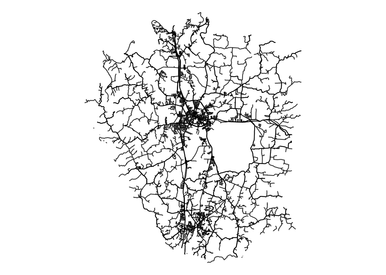
Roads of Madison County, Ky.
In the final plot below there are two maps of the counties of Kentucky.
In the top map, colours correspond to the proportion of residents in a county that have access to broadband internet, according to the FCC.
The colouring in the bottom map represents estimates of the same proportion, according to Microsoft.
The two plots differ substantially.
According to the first plot, the proportion of residents having access to broadband internet appears to be high in most counties.
However, the second plot suggests that the actual proportion of people in counties using the internet at broadband speed is much lower, except perhaps in the vicinity of cities like Lexington, Louisville, Bowling Green and Cincinnati.
Source code: https://github.com/MHenderson/internet-access
